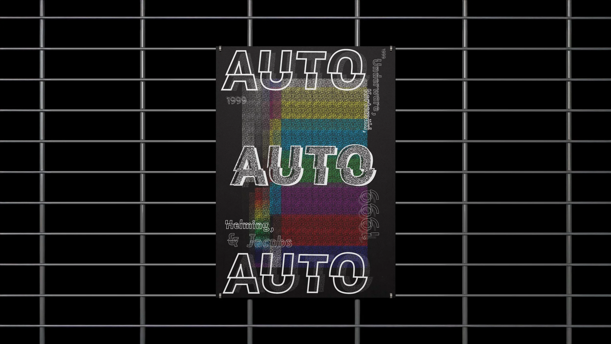
“Auto” Typeface Poster
This is a poster I developed to celebrate the Typeface “Auto”. Included on the design is the year Auto was created, along with the names of it’s original designers. My inspiration for this poster was very 1980’s influenced, which is ironic, considering the typeface was not created until the 90’s. I created a rainbow static pattern all from the Auto Typeface family letterform “I”, to mimic old static channels on box television sets. This gave off the feeling of movement, and flow. The outer design of the poster contrasts that of the brightly hued inside, with a monochromatic color palette. The feeling of activity continues throughout the words on the page: as the wordforms are cut in half, each back half staggering behind their front halves, desperately trying to reach one another. Semi-transparent static pattern is used to create shadows. This piece is very dynamic, in both color and form. It was designed as my ode to the 80’s. All elements were created using Adobe Illustrator.